February 2026
🧰 Cartisan’s Swiss Army Knife
of Geospatial Product Thinking
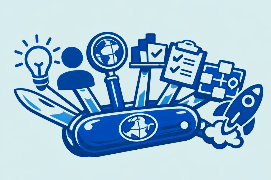
A practical toolbox of seven product-thinking tools for geospatial makers — designed to help you move from GIS capability to products that are clear, usable, and high-impact.
Who it’s for
This framework is for:
• GIS specialists building tools and platforms
• geospatial founders and makers launching products
• teams delivering digital twins, internal platforms, SaaS, and spatial decision-support tools
What it is
These aren’t rigid phases. They’re tools you can reach for at the right moment:
• to reduce risk,
• to avoid building the wrong thing,
• and to make your product easier to explain, test, and launch.
How to use it
Use this as a self-check:
• If your answer looks like the “bad habits” column, it’s not failure, it’s a signal to reach for that tool.
• Skipping tools doesn’t make you faster. It pushes learning into the most expensive phase: the build.
-
What it is
A clear statement of what you’re building, who it’s for, and why it matters.
What “good” looks like
A short, 1–2 sentence statement that is user-value led, specific enough to guide decisions, and clear about why this should exist now.
Why it matters
A strong vision sets direction and makes trade-offs easier. It gives you a filter for decisions and a way to say “no” to ideas that don’t serve the core outcome.
If you skip this
You’ll feel constant scope creep. Every idea will sound equally good, and stakeholders will pull the product in different directions.
Example
Good: “Help electricity operators quickly understand network disruption impacts so they can respond faster.”
Weak: “Build a platform to visualise electricity data.”
Key questions to ask
Why does this exist?
Who benefits if it works?
What problem disappears if we succeed?
Common bad habits
Treating a feature list as a vision.
Leading with technology instead of user value.
Writing statements that are too vague to guide decisions.
-
What it is
Understanding who will actually use the product, what they’re trying to do, and what problems are getting in their way.
What “good” looks like
User needs are problem-focused, grounded in real-world context and constraints, and based on evidence rather than assumptions.
Why it matters
Designing from empathy leads to better outcomes than designing from internal or GIS-centric assumptions.
If you skip this
You risk building tools users don’t care about, then spending time and money fixing adoption problems later.
Example
Good: “As a network analyst, I need to see affected pylons without interpreting raw GIS data.”
Weak: “Users want more layers.”
Key questions to ask
Who actually experiences this problem?
What are they trying to do today?
Where do they struggle?
Common bad habits
Assuming “the user is everyone”.
Describing roles instead of needs.
Designing primarily for yourself as a GIS expert.
-
What it is
The ecosystem your product sits within — including tools, data, workflows, constraints, and opportunity.
What “good” looks like
An understanding of existing tools, awareness of data and technical limitations, and a focus on real gaps and friction.
Why it matters
It helps you avoid reinventing the wheel or building something that doesn’t fit how work is actually done.
If you skip this
You may discover late that something already exists, or that integration and adoption are far harder than expected.
Example
Good: “Users export data from three systems and manually combine it.”
Weak: “Other GIS tools aren’t very good.”
Key questions to ask
How is this solved today?
Where is the friction?
What’s missing?
Common bad habits
Claiming “no one else does this”.
Ignoring data or system constraints.
Over-focusing on features while missing trust, usability, or credibility.
-
What it is
A prioritised list of what the product does.
What “good” looks like
Features are directly tied to user needs, scoped as a small and focused MVP, with a clear list of what is “not now”.
Why it matters
It controls scope and keeps the product easier to build, explain, and test.
If you skip this
Build time blows out, complexity increases, and the product becomes harder to use and harder to sell.
Example
Good: “Top five affected areas, time filter, export summary.”
Weak: “Full GIS editing, dashboards, reporting engine.”
Key questions to ask
What must this do to be useful?
What can wait?
What adds little value?
Common bad habits
Copying features from competitors.
Trying to please every stakeholder.
-
What it is
Visualising how users move through the product and complete tasks.
What “good” looks like
Prototypes are workflow-first, rough but clear, and explicitly built to learn rather than impress.
Why it matters
It surfaces assumptions early and allows you to iterate cheaply before building.
If you skip this
UX issues appear late, rework becomes expensive, and adoption suffers.
Example
Good: “Select incident → assess impact → export briefing.”
Weak: “A polished dashboard mock-up.”
Key questions to ask
What happens step by step?
Where do users get stuck?
Common bad habits
Polishing UI too early.
Designing screens without thinking about flow.
Copying GIS-only interface patterns without questioning them.
-
What it is
A tangible, working slice of the idea that people can interact with.
What “good” looks like
A PoC uses real or representative data, is thin but functional, and is explicitly built to learn.
Why it matters
It makes spatial interactions real and allows users and stakeholders to give meaningful feedback.
If you skip this
Constraints surface late, stakeholders don’t “get it” until it’s expensive, and rework increases.
Example
Good: “A simple interactive map using real data.”
Weak: “A full system build before validation.”
Key questions to ask
What becomes clear once people see this?
What breaks?
What surprises us?
Common bad habits
Over-engineering.
Treating a PoC as a production system.
-
What it is
Releasing the product and learning from real-world use.
What “good” looks like
A soft or beta launch, clear feedback loops, and an iteration mindset.
Why it matters
Launch is the beginning, not the end. Learning from real use is what improves the product.
If you skip this
Products stagnate, adoption drops, or tools are quietly abandoned.
Example
Good: “Pilot with one team, learn, then scale.”
Weak: “Launch once and move on.”
Key questions to ask
What did we learn?
Did it work?
What’s next?
Common bad habits
Big-bang “final” delivery.
No plan for learning or iteration.